I would literally just grab FORTRESS and place it underneath the logo, centre-aligned under the 'arc' of the logo... if that makes sense?Nick_917 wrote:Made this in Word (I don't have photoshop at home) in 5 minutes, but you get the idea. Here's how I think the cover could be improved with just two simple changes.
Do you love the album art?
Re: Do you love the album art?

Re: Do you love the album art?
ODR will always be my favorite other than Human Clay. Like most people I'm a huge fan of Dan's but this just looks rushed. The only redeeming quality about it is the photography.. I'm guessing this is an original image from Dan or another photographer (not photoshopped). Hopefully the rest of the layout and other single covers look better.

Re: Do you love the album art?
has anyone considered the fact that all these various edits the people on this forum are coming up with were already considered by Dan and the band and maybe they chose to go with the RED color for a reason ?
Maybe they didn't want to play it safe ?
Maybe they didn't want to do it like most people would ?
maybe they want to challenge people's opinions about how the cover art should look ?
Maybe they didn't want to play it safe ?
Maybe they didn't want to do it like most people would ?
maybe they want to challenge people's opinions about how the cover art should look ?

Re: Do you love the album art?
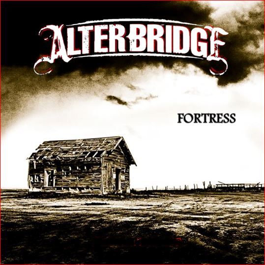
The actual cover is really quite a bit different from the one Roadrunner put up, they must have had a rough version or something. When you flip between the two pretty much the only thing that doesn't alter is the position of the shack. It's really a hell of a lot better.
For all of the hope that it brings...
-
Timotheus

- Little Belgian Waffle
- Posts: 16846
- Joined: Mon Jun 18, 2012 3:52 am
- Location: Belgium シ
- Contact:
Re: Do you love the album art?
If they wanted to make a statement like that they should've gone extremer, and not just make the font look like crap. There's too much ambition in AB's cover..joey78 wrote:has anyone considered the fact that all these various edits the people on this forum are coming up with were already considered by Dan and the band and maybe they chose to go with the RED color for a reason ?
Maybe they didn't want to play it safe ?
Maybe they didn't want to do it like most people would ?
maybe they want to challenge people's opinions about how the cover art should look ?

This one looks like there was put no effort in it. Completely stupid and cheap, but it works because it sucks (and it's funny, that helps too).

anguyen92 wrote:Oh well. Deal with it.
Re: Do you love the album art?
^ Yeah exactly, there's a difference between sucking for comedy value and trying to be all dark and serious and sucking.
AllC392Was wrote:How is Macca funny?

Re: Do you love the album art?
As was said before, having a crappy font doesn't really challenge anyone's expectations, at least not in any interesting or worthwhile way. If you're looking for an album cover that does that, then look no farther than Kanye West's YEEZUS.joey78 wrote:has anyone considered the fact that all these various edits the people on this forum are coming up with were already considered by Dan and the band and maybe they chose to go with the RED color for a reason ?
Maybe they didn't want to play it safe ?
Maybe they didn't want to do it like most people would ?
maybe they want to challenge people's opinions about how the cover art should look ?

Just a blank CD case with some red tape, the only writing on it is on the back giving credit for the samples. It completely challenges the notion of what constitutes an album cover and how music should be represented visually, all the while still doing a perfect job of encapsulating the album's raw, minimalistic feel.
That being said, I think the fortress being a shed does a pretty good job on its own, in a less radical way, of challenging expectations. I think that surprise is rewarding and I'm glad they did it. The font just looks bad though. It doesn't contribute to that experience, it just looks like it was rushed. It immediately takes you out of the art.
gbruin wrote:Everything Nick says is true. Even when he disagrees with me. Then it's extra true.
Re: Do you love the album art?
i like the image.. it looks like that shed is the sturdiest thing out there.. the fortress.. as it is the only thing still standing.. i like the eerie vibe..
not too happy with the red on red logo, they could have changed the "shadow/border" into the sepia to give the logo more spirit.. (but thats my personal taste)
not too happy with the red on red logo, they could have changed the "shadow/border" into the sepia to give the logo more spirit.. (but thats my personal taste)
"Sing it, Stijn!"— Myles Kennedy, during Rise Today
Heineken Music Hall, Amsterdam, 3 November 2013
Re: Do you love the album art?
This is a bigish version of the final cover, the red is far less stark and there's more contrast in the photo:

For all of the hope that it brings...
Re: Do you love the album art?
Is it just me or does Fortress look off centre?
AllC392Was wrote:How is Macca funny?
Re: Do you love the album art?
personally i would have loved them to add the border in the sepia like in this image:
 to bring some life to the logo... but whatever they have doen, must have had a reason..
to bring some life to the logo... but whatever they have doen, must have had a reason.."Sing it, Stijn!"— Myles Kennedy, during Rise Today
Heineken Music Hall, Amsterdam, 3 November 2013
Re: Do you love the album art?
@macca, it is off center, the entire second S is out of the center.., the T however is exactly dead center.
"Sing it, Stijn!"— Myles Kennedy, during Rise Today
Heineken Music Hall, Amsterdam, 3 November 2013
Re: Do you love the album art?
Yeah it's moved to the right relative to the other one.Macca wrote:Is it just me or does Fortress look off centre?
I did a little gif (leave me alone, I was bored) to see what changed - http://i.imgur.com/9oH5IeX.gif - pretty much everything moved/changed.
[edit by axlar to add the image so ppl don't have to click]

For all of the hope that it brings...
-
Drivenunder4

- Hardcore TABN'er
- Posts: 838
- Joined: Mon Jun 18, 2012 12:11 am
- Location: Hattiesburg, MS
Re: Do you love the album art?
Damn it! Just when I was starting to think the cover wasn't THAT bad you had to point that out... OCD is now in full motionMacca wrote:Is it just me or does Fortress look off centre?

Re: Do you love the album art?
i wonder if the inlay will have a close-up of the door with the 2 signs!!Ubik wrote:I did a little gif (leave me alone, I was bored) to see what changed - http://i.imgur.com/9oH5IeX.gif - pretty much everything moved/changed.
"Sing it, Stijn!"— Myles Kennedy, during Rise Today
Heineken Music Hall, Amsterdam, 3 November 2013
Re: Do you love the album art?
Must've been added for a reason! Back cover maybe? You can actually see how much editing went into it though, bits added and taken away from the shack, the entire ground moves and changes in some spots... the logo now also looks like a part of the coming storm rather than just a big fat lump of red. It's growing on me a lot.
For all of the hope that it brings...
-
Timotheus
- Little Belgian Waffle
- Posts: 16846
- Joined: Mon Jun 18, 2012 3:52 am
- Location: Belgium シ
- Contact:
Re: Do you love the album art?
To be honest, I don't think the letters look better in the second version. It looks very sloppy at the light parts of the clouds.
anguyen92 wrote:Oh well. Deal with it.
Re: Do you love the album art?
I know what you mean but the colour alone makes it a ton better for me.
For all of the hope that it brings...
-
Timotheus
- Little Belgian Waffle
- Posts: 16846
- Joined: Mon Jun 18, 2012 3:52 am
- Location: Belgium シ
- Contact:
Re: Do you love the album art?
I really don't know if I like it better. I'm still hoping they'll just keep the letters off the actual cover. That they're only on these versions for commercial reasons.
False hope is better than no hope I guess
False hope is better than no hope I guess
anguyen92 wrote:Oh well. Deal with it.
-
Drivenunder4
- Hardcore TABN'er
- Posts: 838
- Joined: Mon Jun 18, 2012 12:11 am
- Location: Hattiesburg, MS
Re: Do you love the album art?
Like the band name and title just on the wrapping or as stickers so the actual cover is just the photo? Cause that's kind of what I'm hoping forTimotheus wrote:I really don't know if I like it better. I'm still hoping they'll just keep the letters off the actual cover. That they're only on these versions for commercial reasons.
False hope is better than no hope I guess