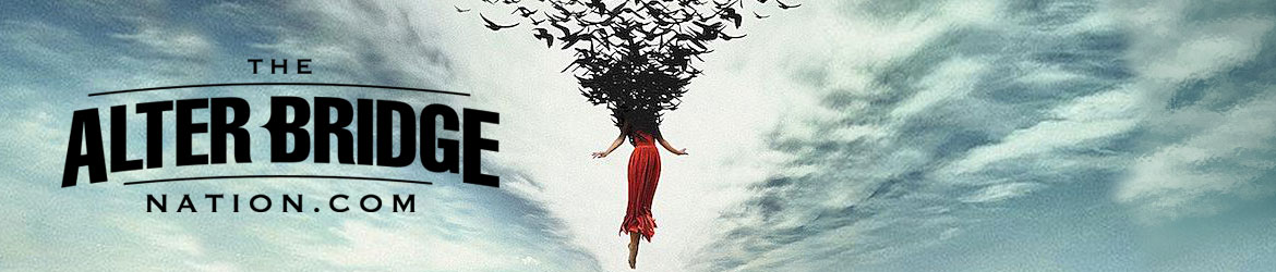
+1Timotheus wrote:To be honest, I don't think the letters look better in the second version. It looks very sloppy at the light parts of the clouds.
Timotheus wrote:I really don't know if I like it better. I'm still hoping they'll just keep the letters off the actual cover. That they're only on these versions for commercial reasons.
False hope is better than no hope I guess